← Back to work
 01 · What difference did we make?
02 · The problem
03 · How I approached it
01 · What difference did we make?
02 · The problem
03 · How I approached it
 04 · Inside the app
 05 · Just the tip of the iceberg
06 · What did I learn from this work?
07 · The product, live
05 · Just the tip of the iceberg
06 · What did I learn from this work?
07 · The product, live
H&N Research
From zero to revenue: Onahn Michelle, a health-tech app
A health-focused iOS app that helps users track vitals, log meals, and scan food using AI.
RoleSole Product Designer
TimelineJuly 2025 to present · shipped in under 10 months
Team2 software engineers
1 backend engineer
1 project manager
1 copywriter
Live App ↗︎
1 backend engineer
1 project manager
1 copywriter
The problem
Health data lived across half a dozen apps, logging a meal was a chore, and raw numbers meant nothing to someone managing a chronic condition.
What I did
Sole designer, end to end: interviews and personas, mapped every flow before drawing a screen, built the design system from scratch, shipped 50+ screens in light and dark.
The result
First paying customers in under 10 months. 70% chose the yearly plan over monthly.
Project under NDA.
Visual assets are restricted, but I'm happy to walk through my design process, technical decisions, and the high-level impact over a call.
Revenue
70%
Yearly plan adoption over monthly
Scale
50+
Screens shipped from one design system
Speed
<10 mo
From concept to first paying customers
1
Step 1 · Listen
Interviews & personas
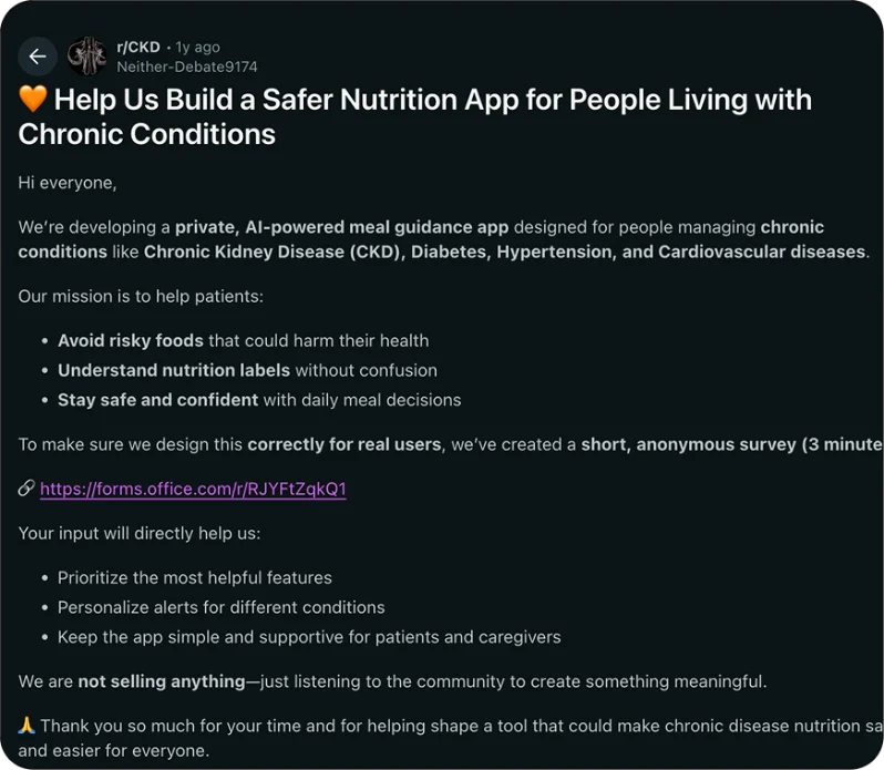
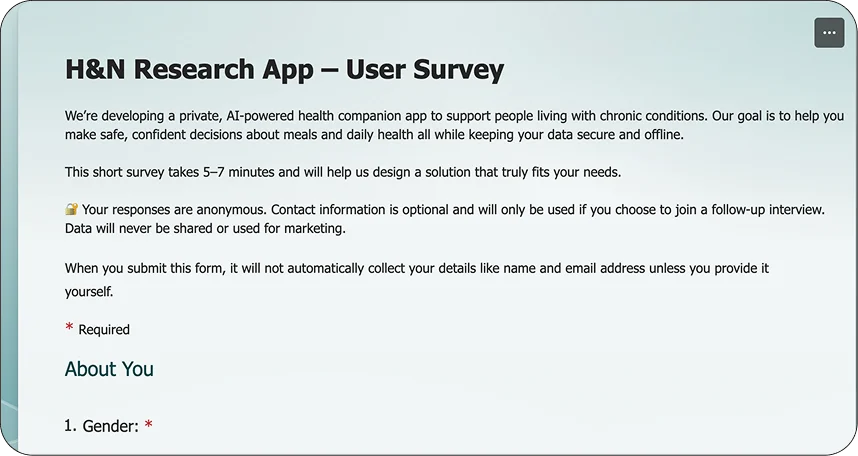
Before anything was drawn, I went where the users already were. Two personas came out of it and shaped every decision after: a patient managing a kidney condition and a health-conscious professional.
Field research on Reddit
User survey on LinkedIn
2
Step 2 · Map
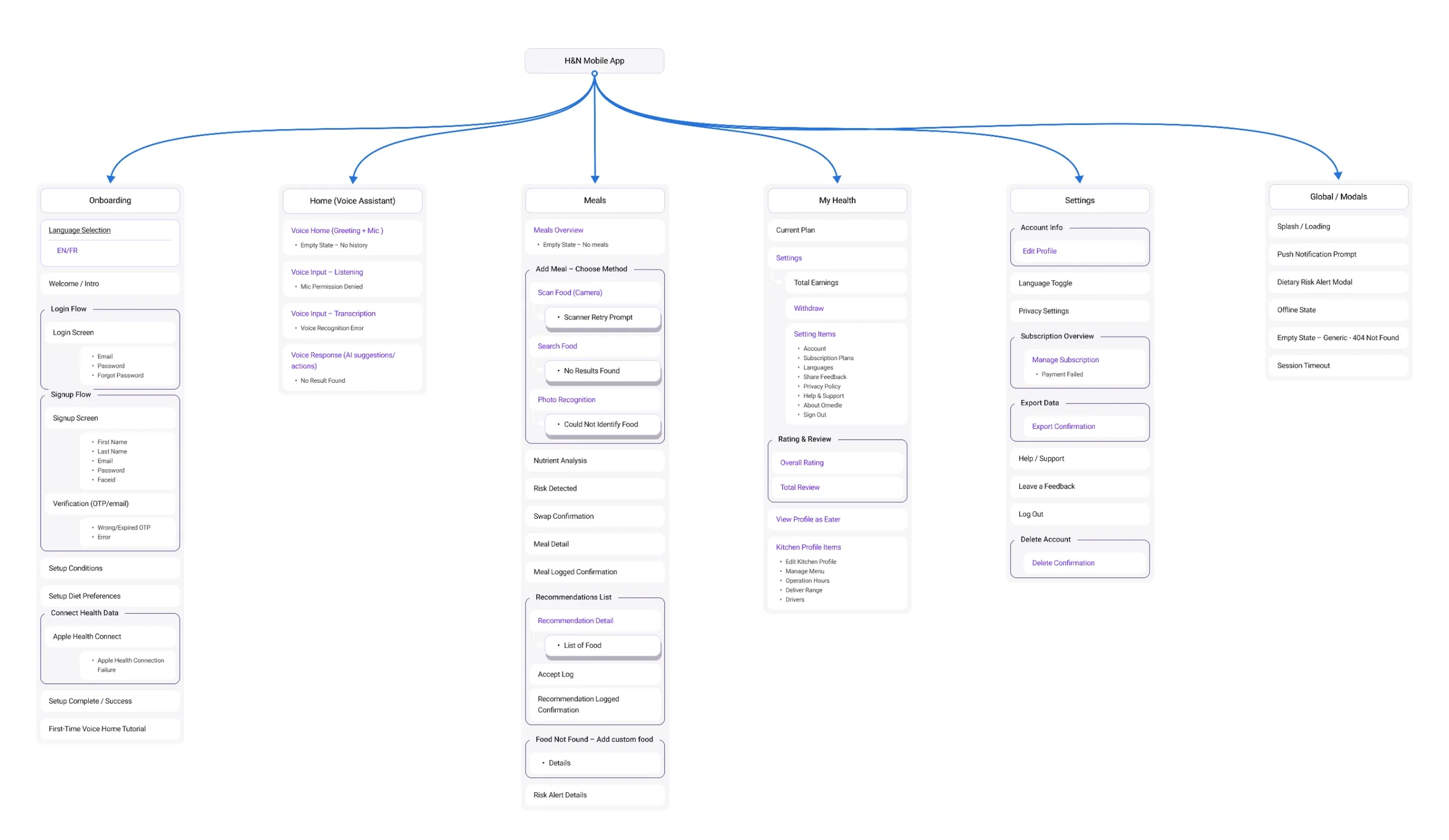
Every flow before any screen
Onboarding, dashboard, meals, health tracking, settings. One map gave the dev team full visibility into scope from day one.
Information architecture of the full app
3
Step 3 · Test
Wireframe, test, iterate
The same screen went through four lives. User testing killed weak ideas early; what survived earned its place.
4
Step 4 · Ship
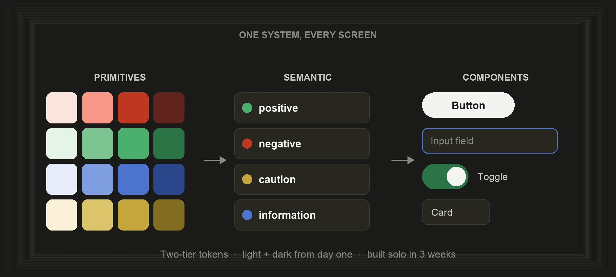
Tokenized handoff, and it never stops
Because every color and style pointed to a semantic token, light and dark mode came from one system. Developers read the same names I designed with, so nothing was lost in translation, and every release loops back into step one.
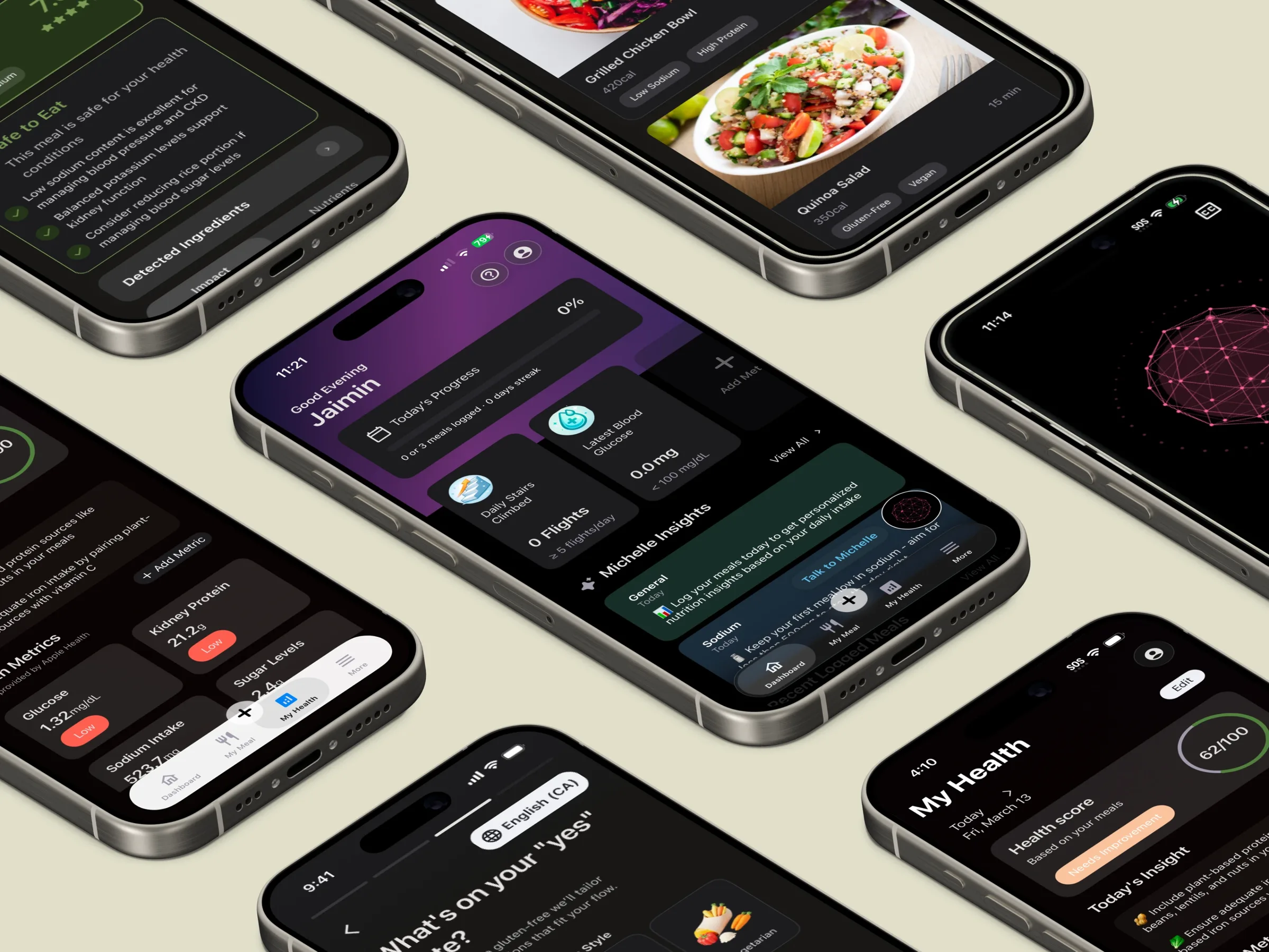
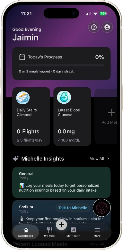
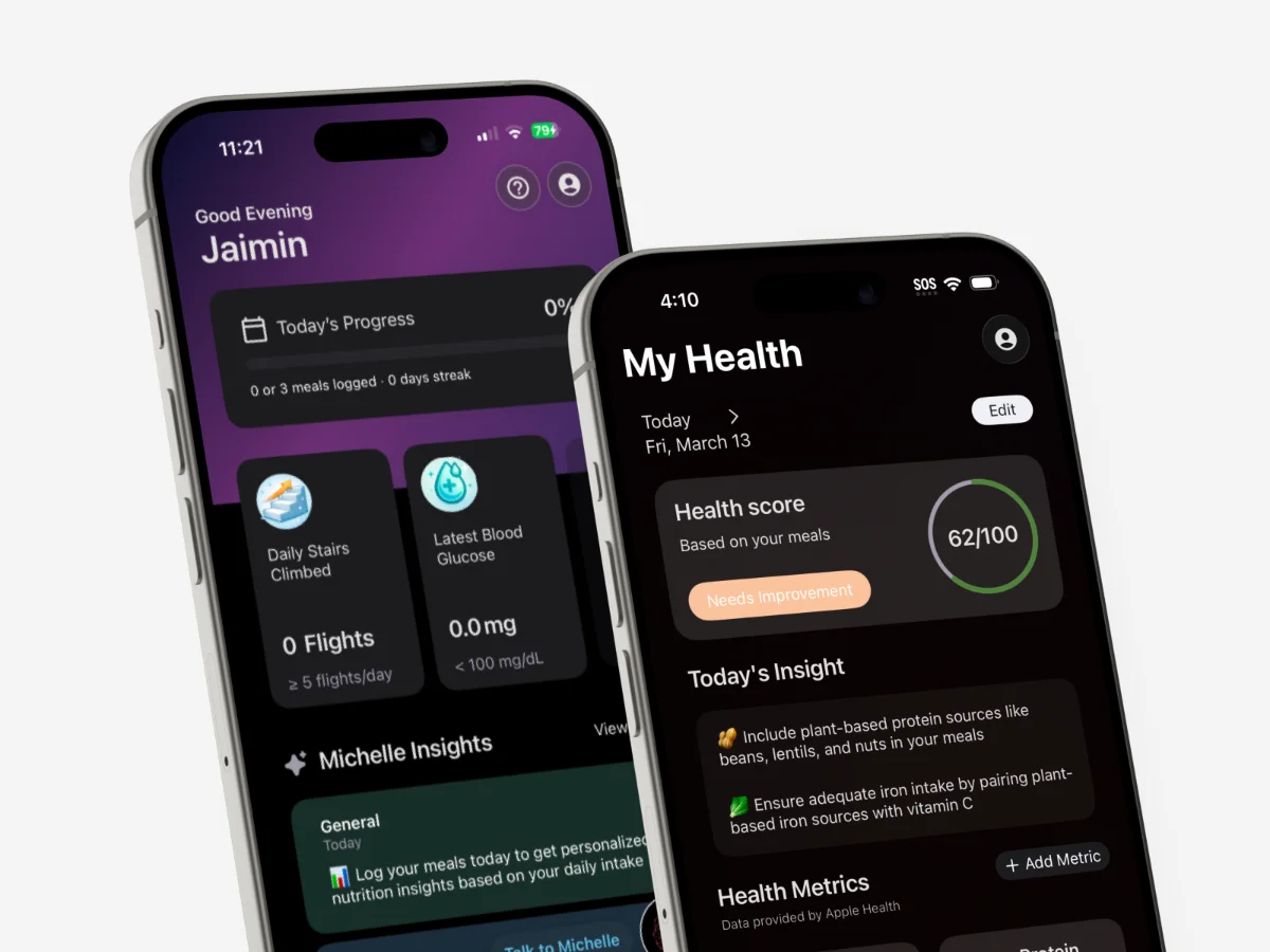
One dashboard, everything that matters
The home screen is built from glanceable cards: meals, vitals, daily progress, and Michelle, the voice AI, one tap away. Nothing is buried more than one level deep.
Card system
Voice AI entry
Vitals at a glance
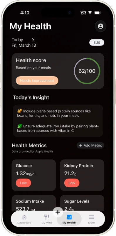
The health screen tracks the metrics that matter to a chronic condition: glucose, kidney function, and protein, alongside today's insight and a single health score. Raw values become answers, readable in one glance.
Health metrics
Health score
Daily insight
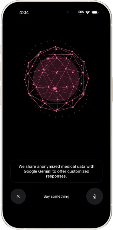
Meet Michelle, the voice AI
Instead of digging through menus, users just talk. Michelle answers questions about meals, vitals, and what today's numbers mean, in plain language, hands free.
Voice AI
Conversational UI
This page is the tip. The real depth shows up in the work.
i.
Constraints are a design tool.
Tokenizing everything early meant each new screen got cheaper to ship, not harder.
ii.
Design for the worst day.
A patient does not browse an app, they check it. That moment shaped every screen.
iii.
Revenue is a UX outcome.
The paywall converted because the onboarding before it proved value first.
Up next
Onahnmichelle Design System
Tokens, semantic variables, and components built for light and dark from day one.
Keep reading →