← Back to work
 01 · What building this actually bought
02 · Foundations
03 · The token pipeline
01 · What building this actually bought
02 · Foundations
03 · The token pipeline
 04 · Two themes, one decision
 05 · What I learned
Onahnmichelle · Design System
One system, every screen
A two-tier token system, built solo before the first screen was drawn, so a small team could ship fast without accumulating design debt.
A solo designer cannot afford design debt. The architecture came first: primitives feed semantic tokens, tokens feed components, components feed screens. One source of truth, so a single token change propagates through the entire product.
Naming was the contract. I wired semantic tokens so developers read the exact same language in code that I see in Figma. Handoff became a conversation about behavior, never about pixels.
RoleSole Product Designer
Timeline2025 to present · built in 3 weeks
TeamSolo
ScopeTokens & theming
Components & states
Documentation & handoff
Components & states
Documentation & handoff
Speed
3 weeks
Full system, built solo, start to finish.
Time per screen
1 day → 1 hour
What a new screen cost at the start versus the end. Once the system existed, screens just composed themselves.
Benchmark
34% faster
Figma's research found designers work 34% faster with a design system than without. Mine was built before the first screen was drawn.
Color
Semantic names describe the job, not the color. Themes swap the primitive underneath.
positive → Green/500
negative → Red/500
text → Core/Basalt
Type scale
Title
Heading
Body
Caption
Four steps, tuned for one-glance reading on health data.
Space & radius
An 8px grid and one radius ramp. No component invents its own spacing.
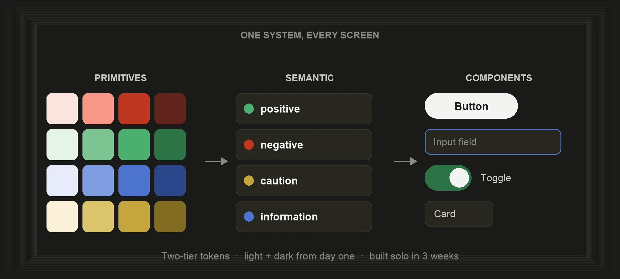
Foundation: the raw material
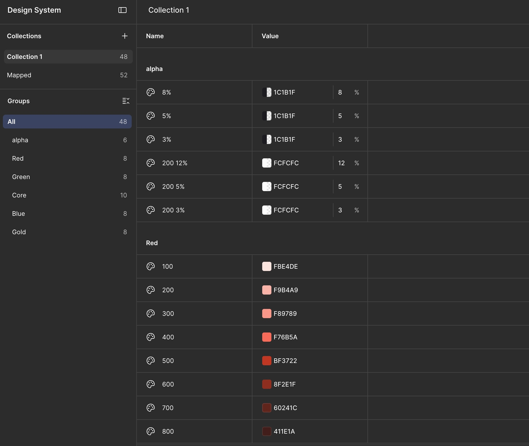
Red / Green / Blue / Gold ramps + alpha
Raw colour ramps and an alpha scale for overlays. Nothing here references a UI role yet.
These are the ingredients, not the recipe.
Primitive
Semantic
Contract: every color named by its job
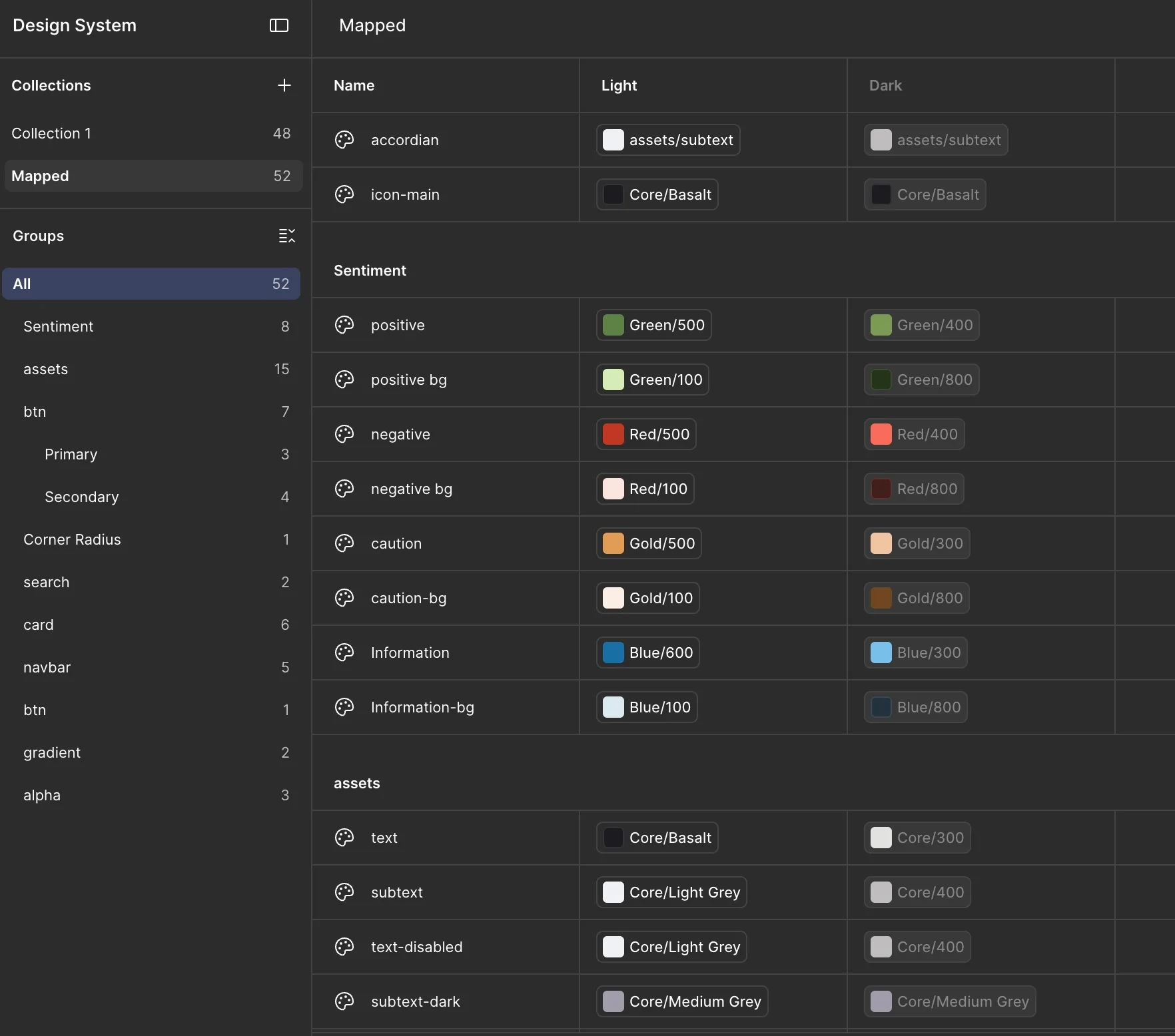
positive / negative / caution / information
Every token resolves to a primitive and carries its own light and dark value. Developers read intent, not hex.
Change the primitive once and both themes update — the decision that let two themes ship from one source of truth.
Semantic
Component
Payoff: components that inherit
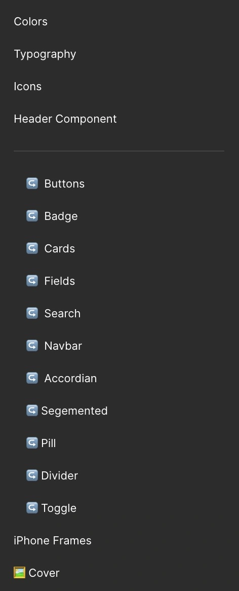
The library, end to end
Eleven core components, each built on semantic tokens with full state coverage.
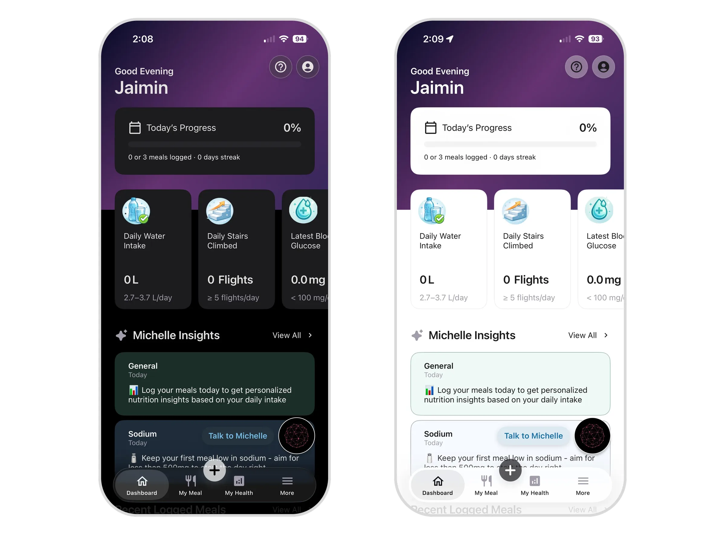
No component invents its own colour — it inherits from the contract above, so one primitive change ripples through the whole library in both themes.
ButtonsFieldsCards
NavbarAccordionToggle
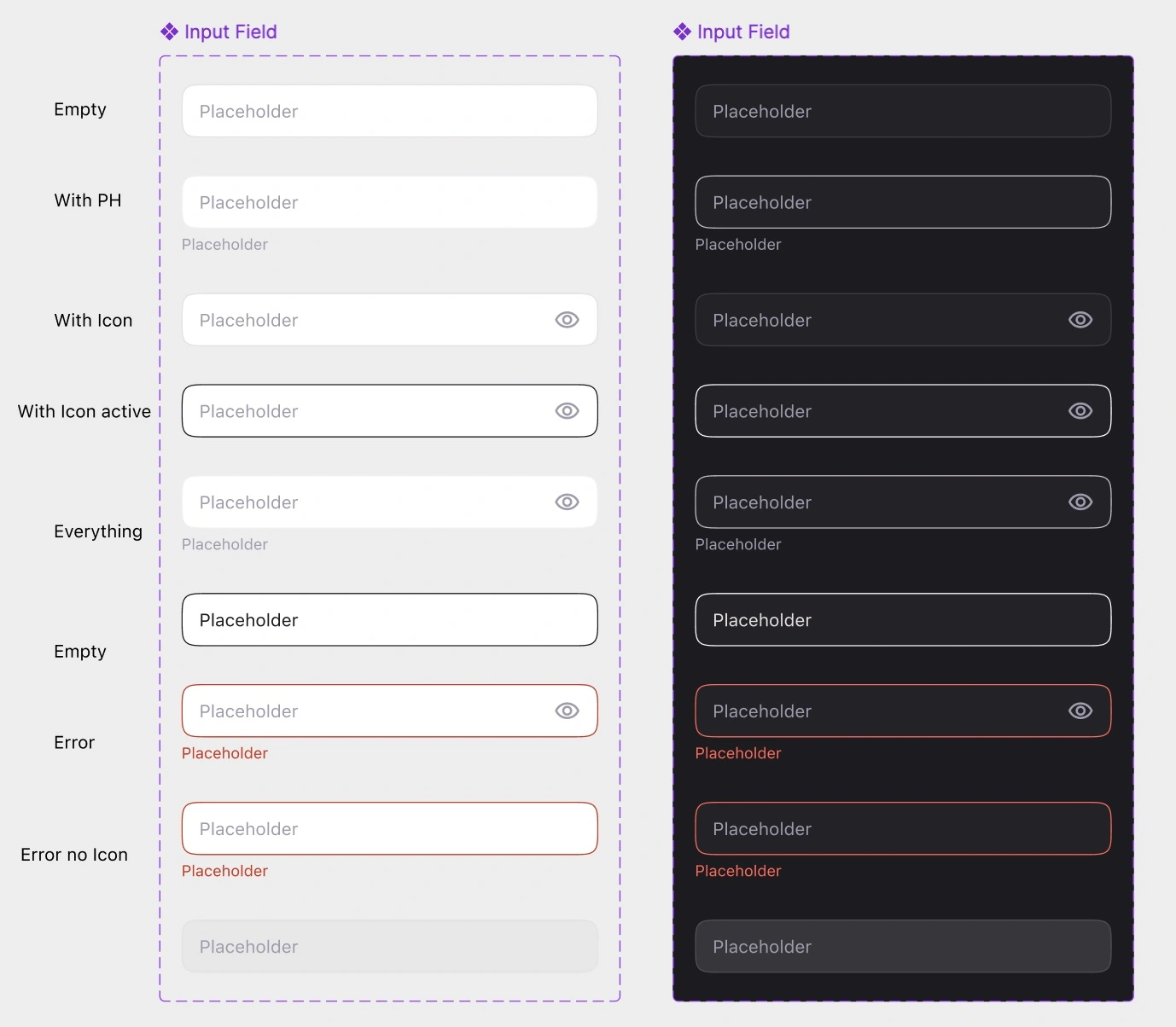
Inputs: 8 states
Full state coverage. Inputs alone carry eight — default, hover, focus, filled, disabled, error, success and read-only.
Each is a token lookup, not a hand-picked colour.
Flip one switch, ship two themes. The variable architecture generates Light and Dark from the same decision: zero extra design work.
The architecture is the hard part
Building the token layer first felt slow, until it was the fastest thing I did. Here's what held up, and what I'd do differently.
What worked
Semantic naming. Positive, not green. Themes swapped underneath without touching a single component.
Architecture before screens. The first screen was slow to build. Every one after cost almost nothing.
An alpha scale, built early. Felt like over-engineering for an MVP, until overlays and disabled states just worked.
What I'd change
Document as I build. I wrote docs after. A system a developer can't read alone isn't finished.
A second set of eyes on naming. Working solo meant no one to sanity-check the contract. I'd add a handoff review earlier.
Prune sooner. A few components earned their place late. I'd cut one-offs to compositions faster to keep the library lean.
Up next
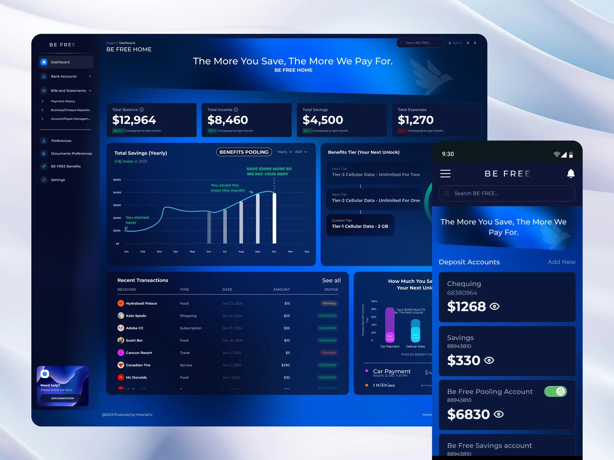
BE FREE Banking
A banking app that pays you more the more you save.
Keep reading →