← Back to work
 01 · What difference did we make?
02 · Introduction
03 · The problem
04 · Goal
06 · Interviews & personas
01 · What difference did we make?
02 · Introduction
03 · The problem
04 · Goal
06 · Interviews & personas
 07 · From insights to innovation
 09 · User testing
 10 · Final design
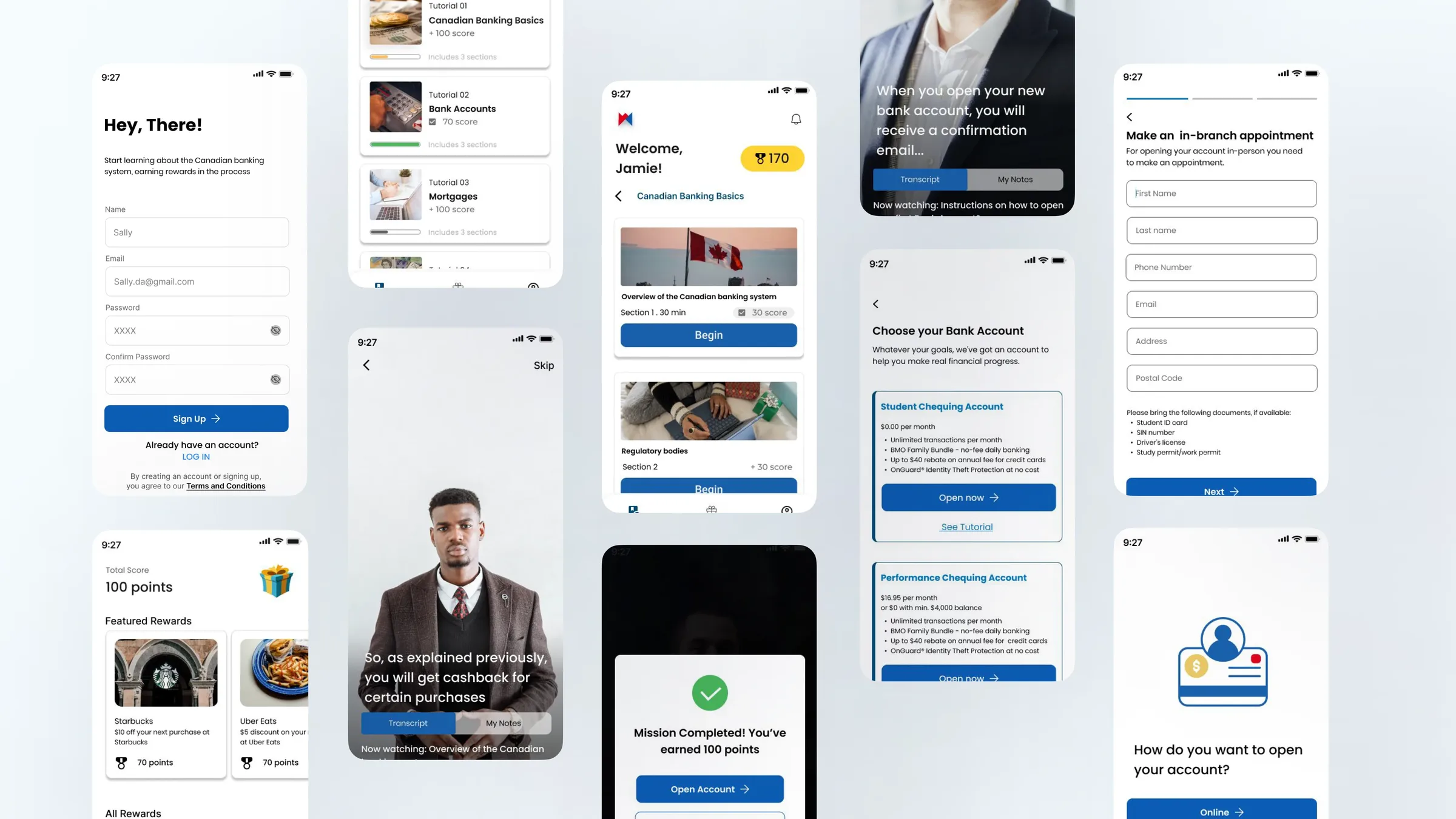 Live Prototype ↗︎
11 · Reflection
Live Prototype ↗︎
11 · Reflection
BMO Redesign
Redesigning the BMO learning experience: simplifying complex financial journeys
Live Prototype ↗︎RoleUI Designer
TimelineJan 2023 to April 2023
TeamTeam of four
ClientBMO
CategoryApp Design
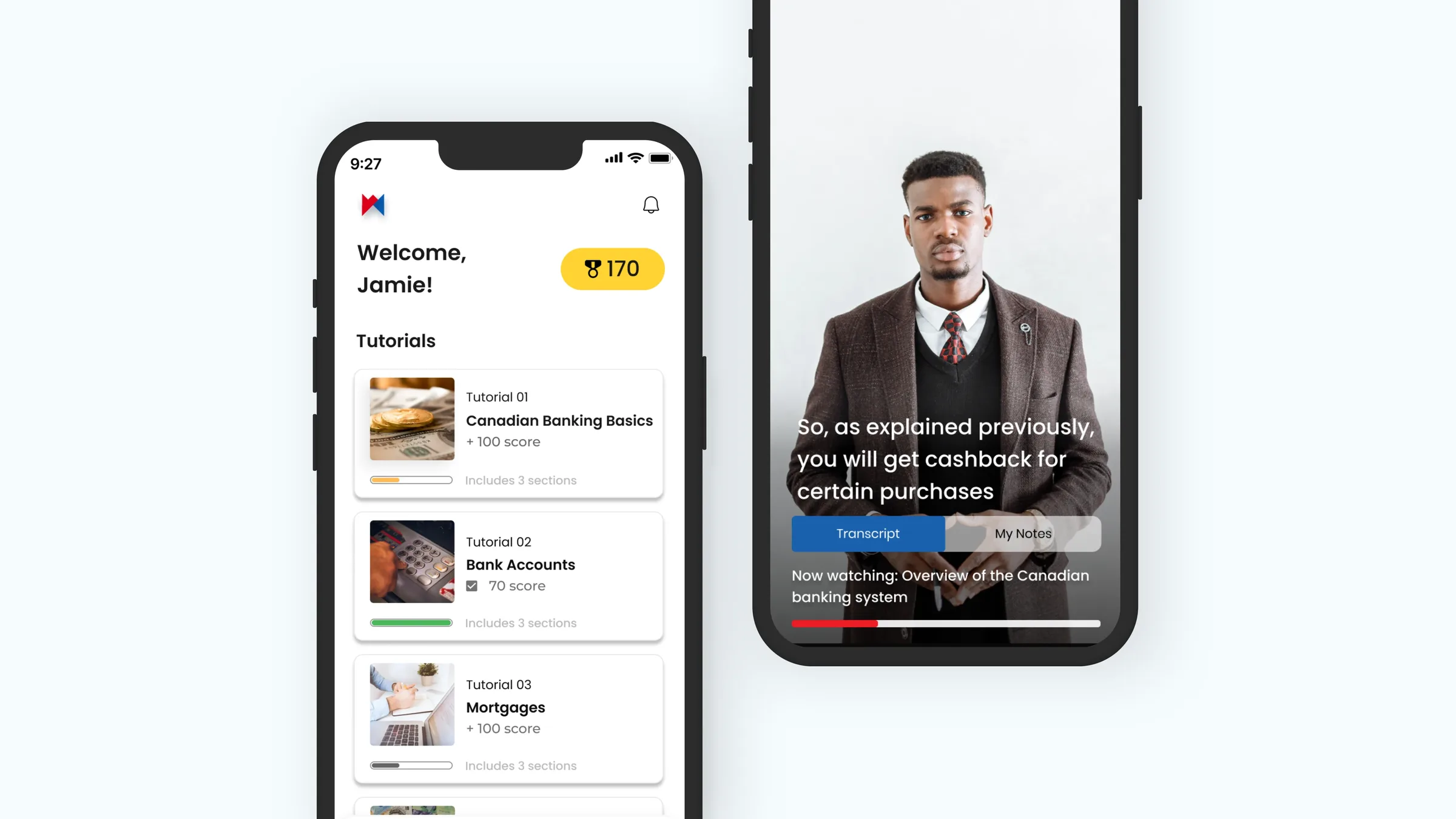
Simplified navigation, digestible content, and personalized learning paths made the platform genuinely usable for newcomers, building trust and confidence in their banking decisions.
Confidence
87%
Of testers felt more confident in their financial knowledge after using the app.
Motivation
70%
Of testers felt more motivated to learn, driven by the gamification.
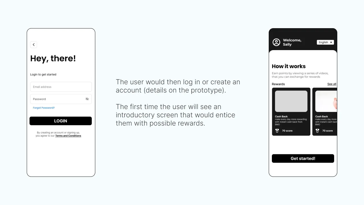
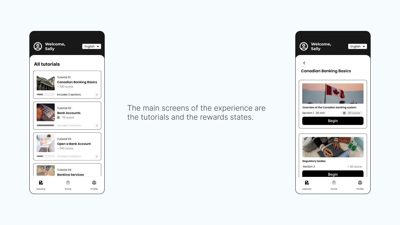
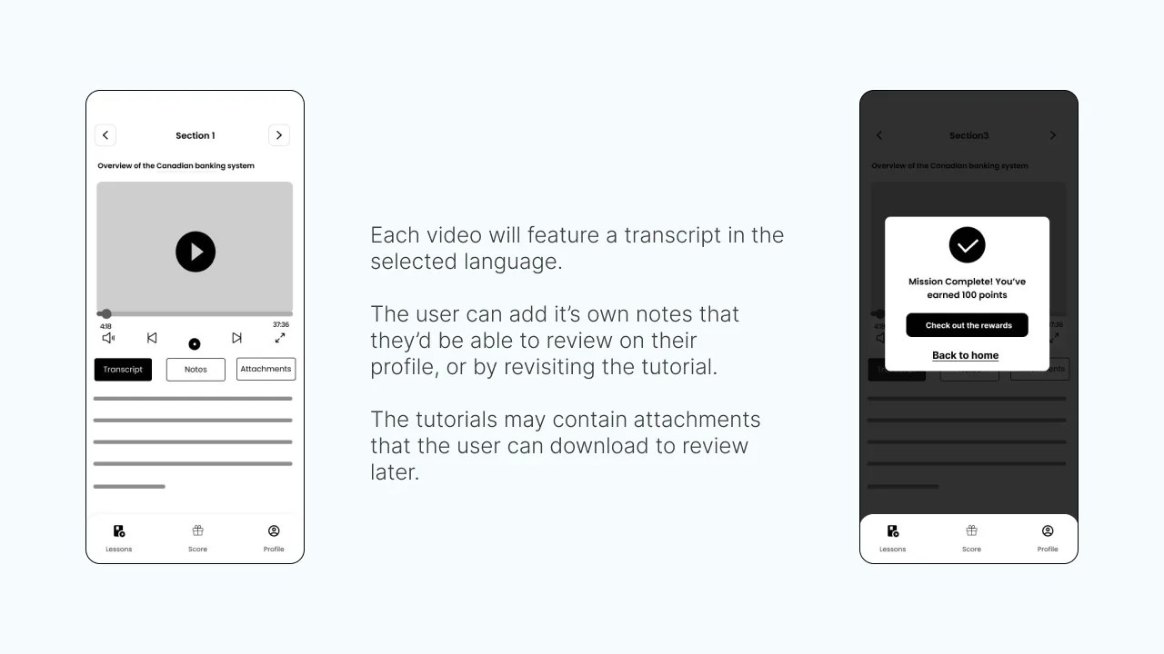
The BMO Learning project aimed to attract newcomers to Canada as banking clients. Our team found that newcomers are often budget-conscious and unfamiliar with Canadian banking. We designed a gamified app that rewards users for learning about banking through tutorials, helping newcomers understand BMO's services and converting them into confident clients.
My role. UI designer, collaborating closely with a team of four throughout the project.
Newcomers to Canada often struggle to navigate the banking system. The existing BMO learning platform was overwhelming: complex information, little personalization, which drove down engagement.
Difficult navigation
Users struggled to move through the platform and find what they needed.
Too much information
Dense, confusing content made financial topics frustrating to grasp.
Lack of personalization
Nothing was tailored to the user, so learning felt generic and less engaging.
The goal: turn an overwhelming platform into a learning experience newcomers could actually use.
Simpler navigation
Make it easy to move through the platform and find the right content fast.
Personalized learning paths
Tailor tutorials to each user's goals, from budgeting to investing.
Digestible content
Break complex financial topics into clear, step-by-step lessons.
Together, these lift engagement, build financial literacy, and help users decide with confidence.
05 · Design process1Research
Research · Interviews · Understanding pain points & needs
2Ideation
Lo-fi wireframe · User testing · Refinement
3Launch
Prototyping · Testing
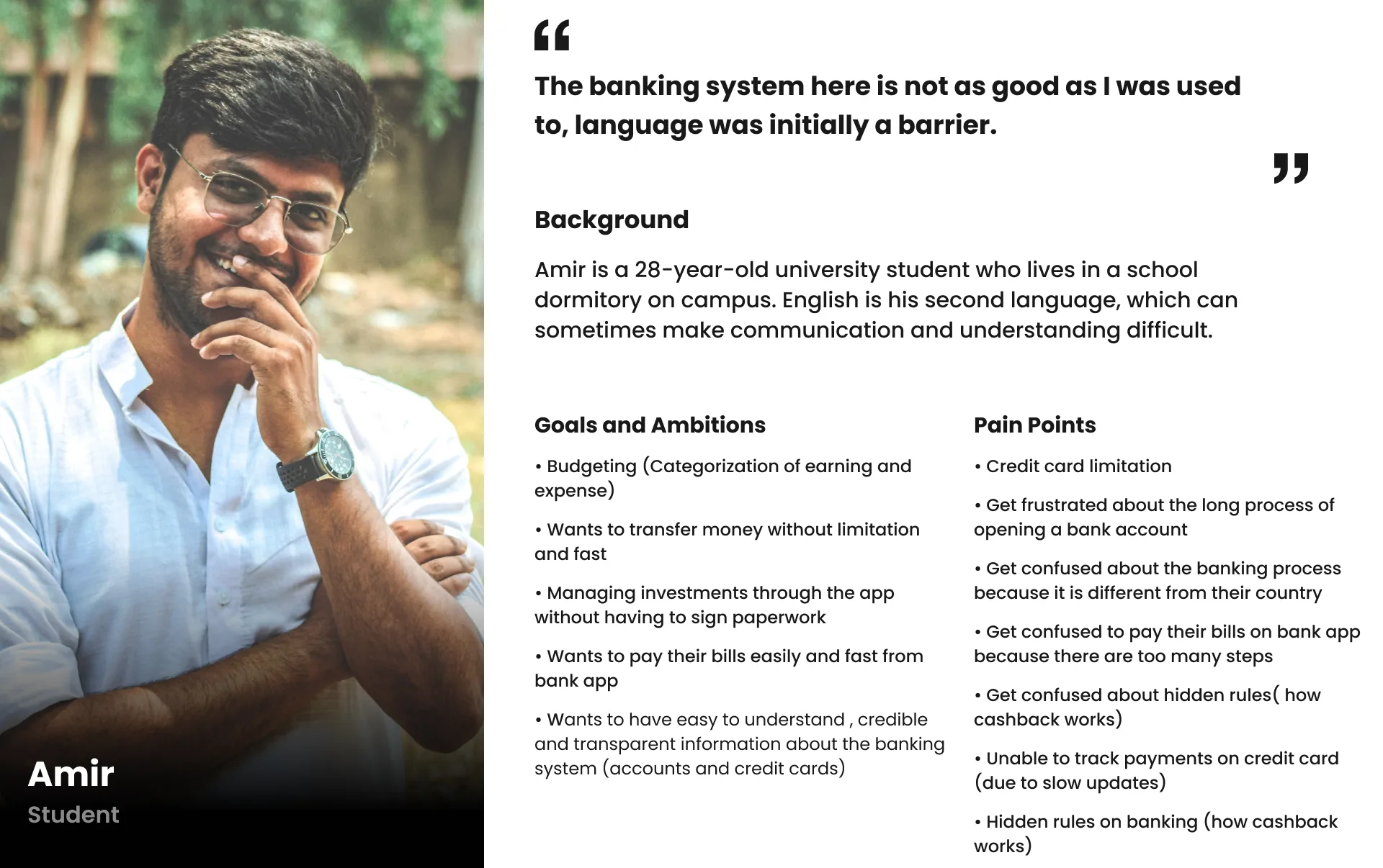
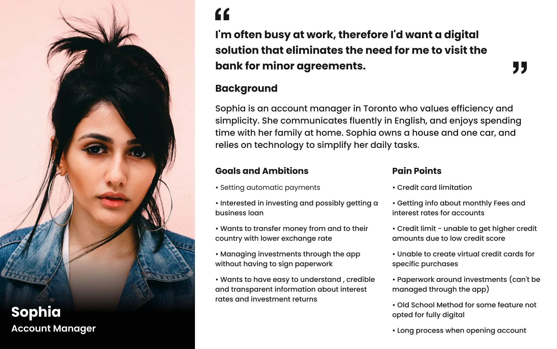
To keep the solution user-centric, we built two personas, Amir and Sophia, to represent the distinct needs and goals of newcomers.
Comfort with banking
Familiarity varied widely, so we built tutorials for different experience levels.
User goals
Students focused on budgeting, professionals on investing, so we tailored learning paths.
Awareness
Many struggled with financial products, so we wrote simple step-by-step tutorials.
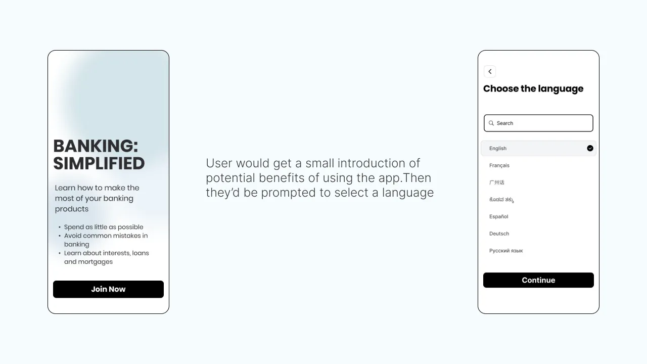
Research surfaced two core problems: overwhelming content and poor mobile accessibility. A dedicated mobile app was the answer, more intuitive, more engaging, and a better fit for how newcomers actually learn.
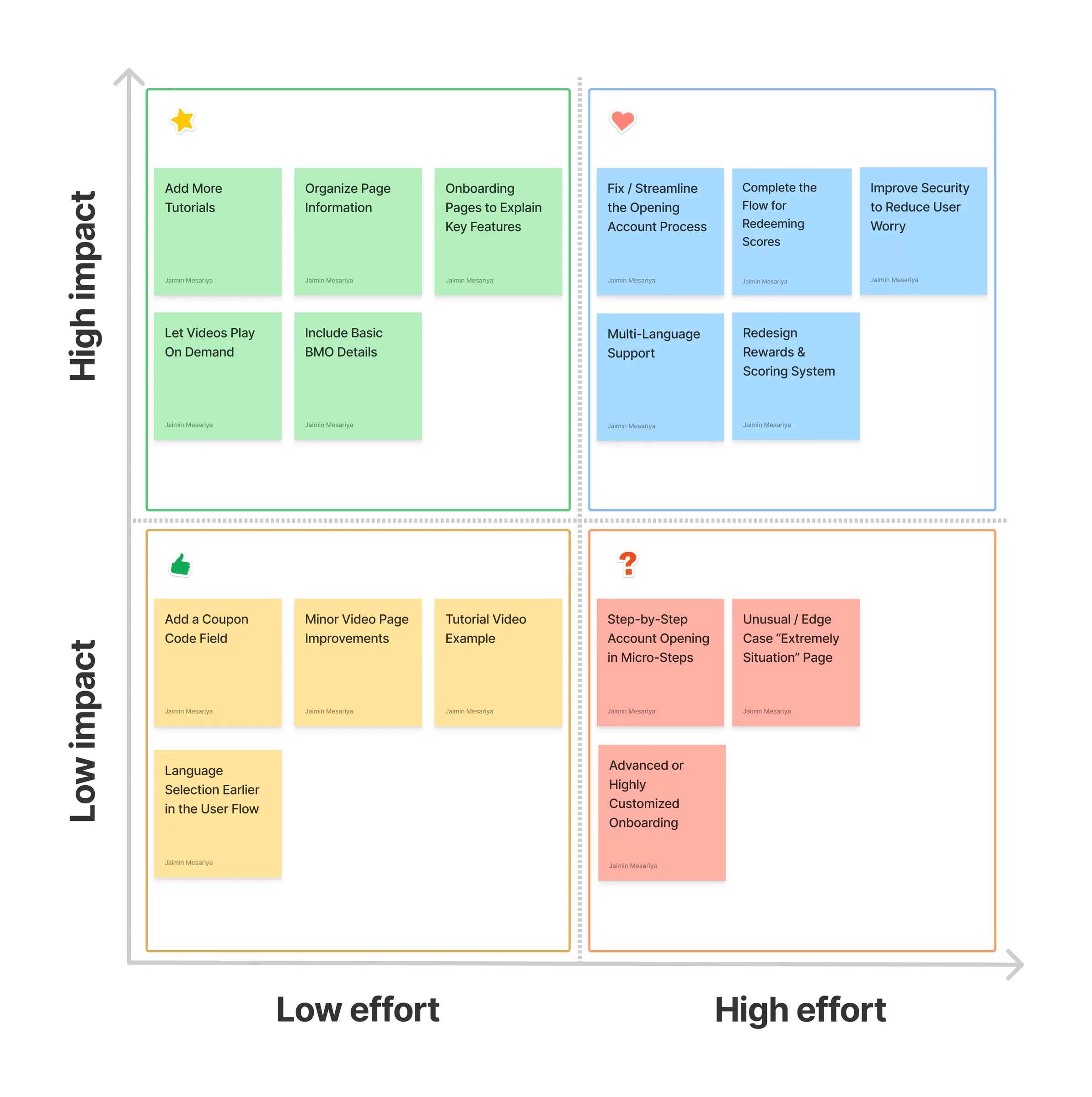
08 · Lo-fi wireframes & flowsLo-fi wireframes let us test and iterate quickly, validating ideas against user needs before high-fidelity design.
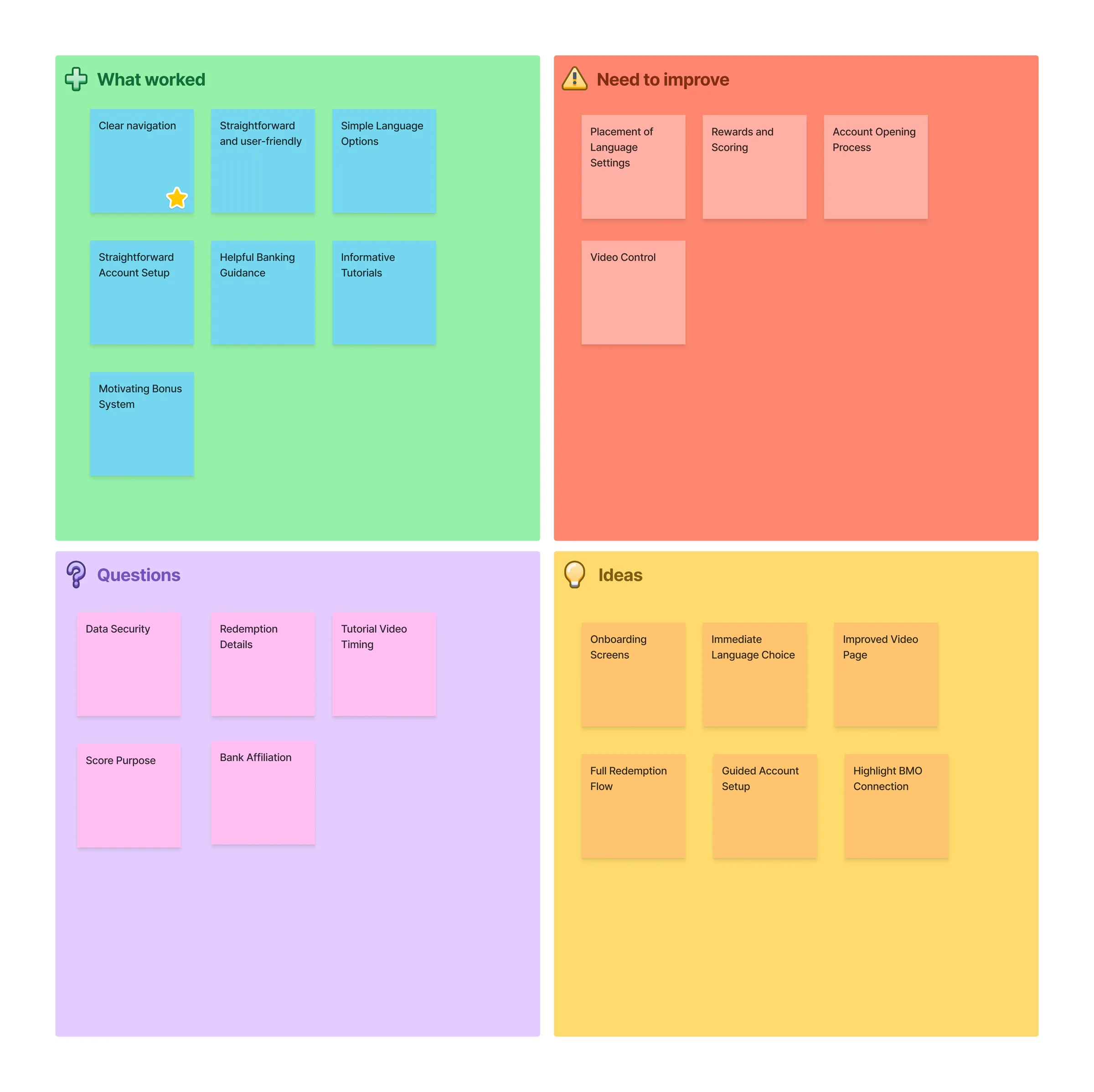
We tested with newcomers using a feedback grid, which sharpened navigation, simplified content, and improved personalization, and confirmed the essential feature set.
Clarity over complexity. Turned a vague brief into a focused, user-first solution.
Design is a team sport. Our best ideas came from collaboration.
Small things matter. The details made the difference.
Business + user thinking. Balanced user needs with business goals at every step.
Up next
Onahn Michelle
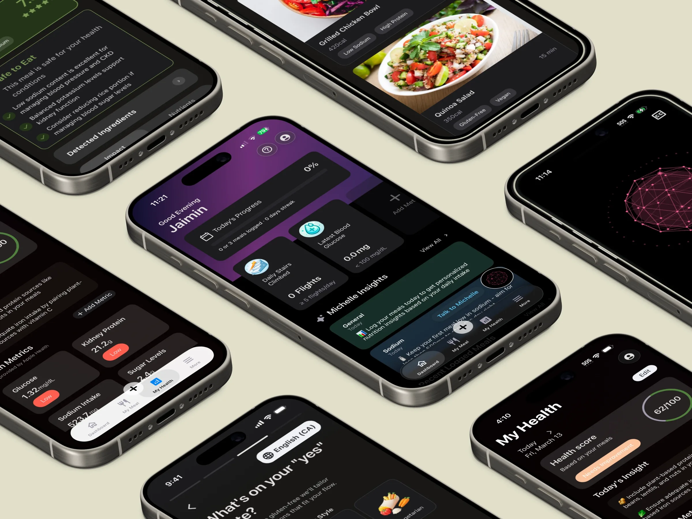
From zero to revenue: a health-tech app taken from first sketch to the App Store.
Keep reading →