BE FREE: a banking app that pays you more the more you save
A novel savings-and-rewards concept made simple enough to trust, delivered consistently across mobile and desktop from one design system.
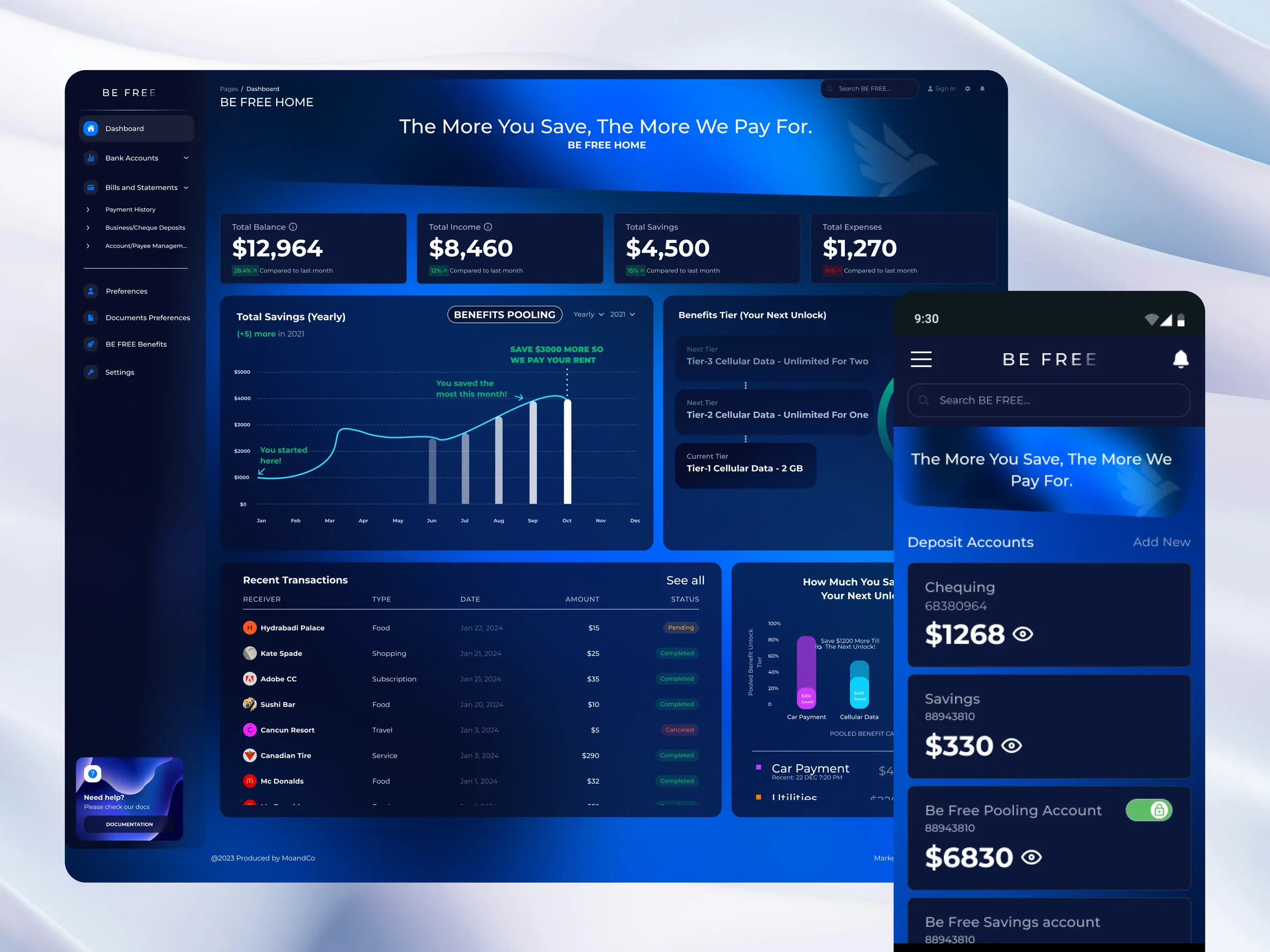
BE FREE is a fintech banking product built on a simple, bold promise: the more you save, the more the bank rewards you. I worked as UI designer on the product, spanning a mobile app and a desktop dashboard, unified by a single design system.
02 · The big idea: benefits poolingBE FREE's standout concept is benefits pooling: instead of saving alone, users pool savings collaboratively and unlock real-world rewards, like cellular data and phone perks, as they hit savings tiers. The core design challenge was making a genuinely novel financial concept feel simple and trustworthy.
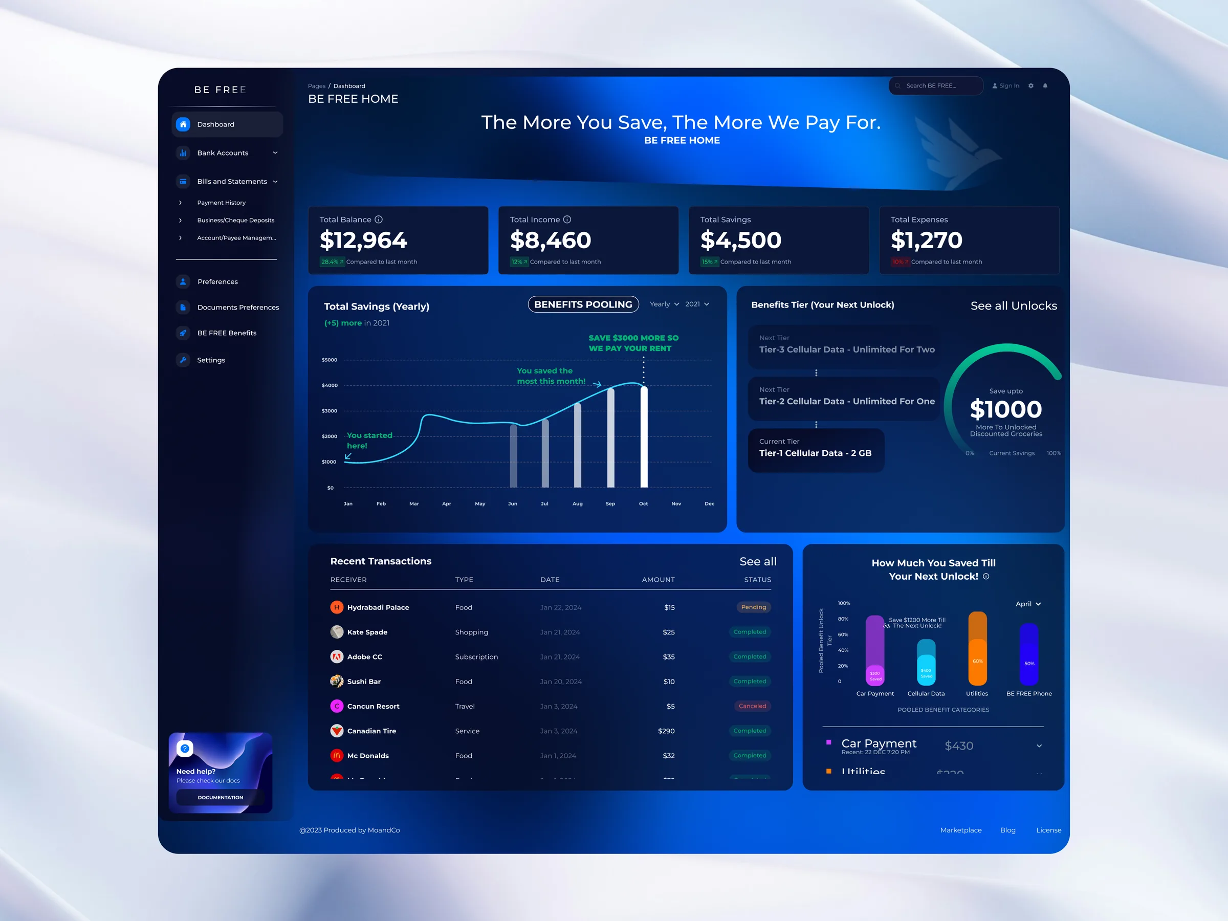
The mobile app carries the everyday banking: deposit accounts, transfers, bills and statements, and the pooling and benefits flows. The design keeps a dense financial product calm and scannable, with clear balances, tier progress, and one-tap actions.
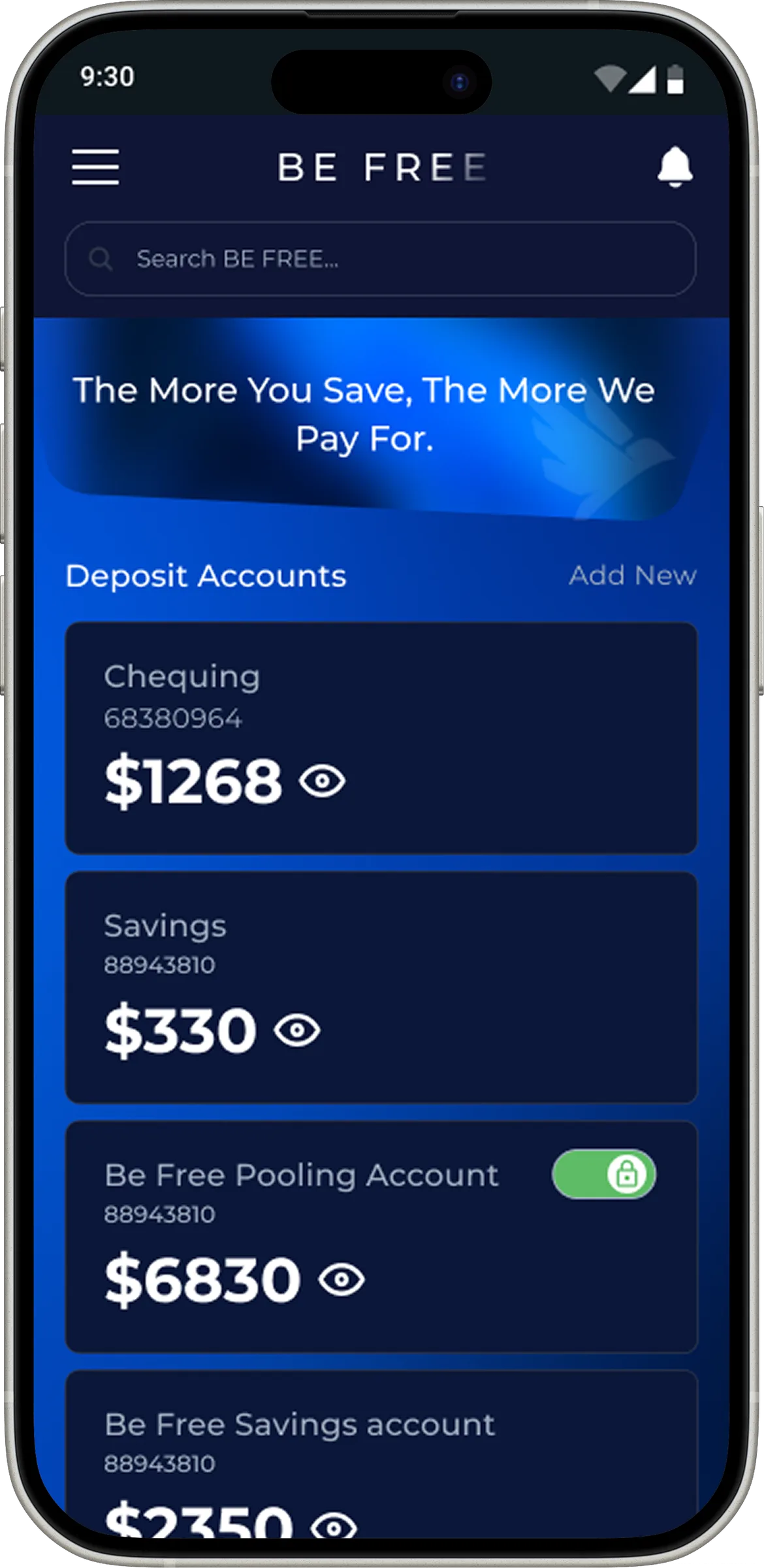
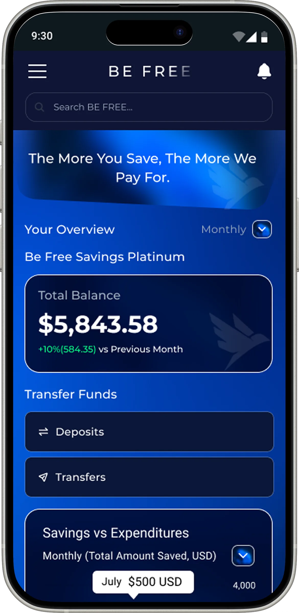
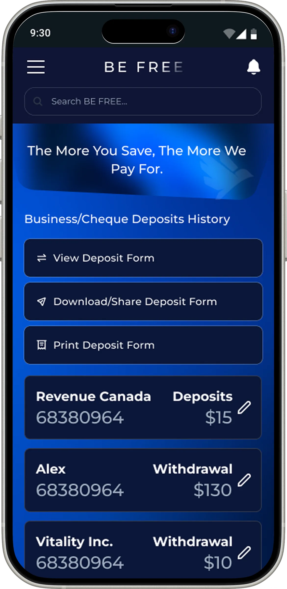
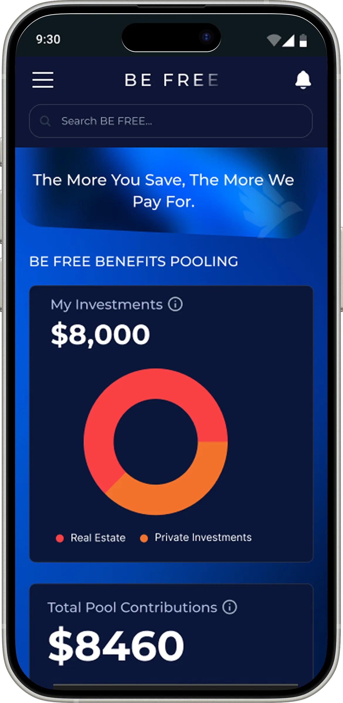
Beyond mobile, I designed a full desktop dashboard so the same banking and pooling capabilities scale to a larger screen, with denser data views, account analysis, and management tools.
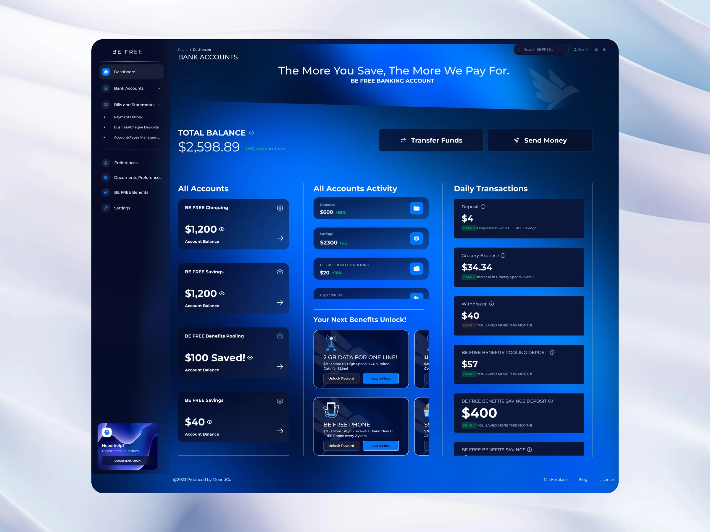
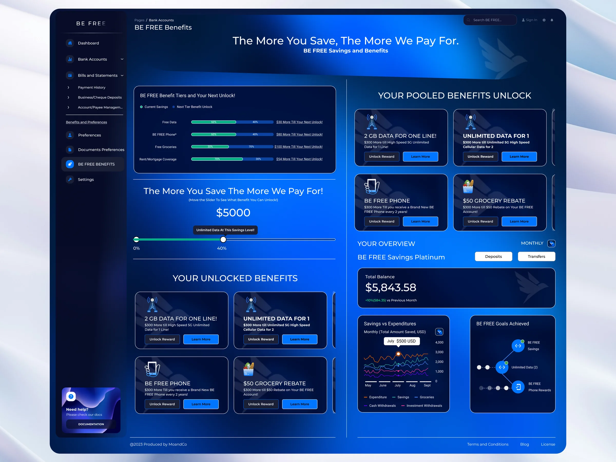
Mobile and desktop share one design system: global dimensions, size and spacing tokens, a grid and page-layout system, and documented icon guidelines. One source of truth kept a large, multi-platform product consistent.
Design system first. One token system kept mobile and desktop consistent as the product grew.
Novel made familiar. The pooling concept was new, so I leaned on familiar banking patterns to make it feel safe.
Built to ship. Designing inside the dev pipeline meant screens were dev-ready, not just pretty.
Test the pooling flow earlier. The concept is unfamiliar; earlier user testing would have de-risked it.
Tighten the handoff loop. More states and approvals than needed; I'd streamline the review pipeline.
The result: a novel savings-and-rewards concept made simple enough to trust, delivered consistently across mobile and desktop from one design system.
BMO Redesign
Simplifying complex financial journeys for newcomers to Canada.
Keep reading →